The Daily Beast Finds New Beauty in Design Makeover

The American news and opinion website The Daily Beast rolled out a new look on Wednesday. We went through some of the biggest changes and gave some advice on how the site could make even more improvements. Take a look at our thoughts, and let us know your two cents in the comments section below!
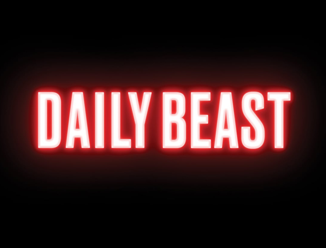
The Logo: According to a blog post by Editor-in-Chief and Managing Director John Avlon announcing the change, “We’ve ditched the old white on red logo for something that reads like a neon sign in your favorite diner or bar.” It definitely feels that way. With the red glow around the lettering and the dark blue background, they nailed the storefront-night-signage look. The update tends to feel less like an upgrade and more like a push to be different.

Avlon said the new logo reflects The Daily Beast’s identity as a “bold alternative to content farms, predictable partisan sites, and the commodity news crowd. That’s why [they’ve] chosen a new logo that stands out from the pack.” Interesting choice. We would consider going more subtle with the outer glow.
The Homepage: In the header area of the site, the Daily Beast has completely done away with a traditional navigation. Instead, it’s using a pop-out drawer for different sections of the site, such as its ever-famous Cheat Sheet, the U.S. News, Politics, etc.. It’s functional, mobile first, and makes the header feel clean. With over 40% of the Daily Beast’s traffic being direct, this could help regular visitors find specific sections easier.
Also, the Beast took out its homepage slider. According to The Beast’s CTO Ken Judy, “The carousel we used previously was difficult for some readers to navigate (it always seemed to either move too fast or too slow) and the layout was so rigid that doing seemingly minor things like accommodating longer headlines was difficult without significant time and effort.”

Today the homepage has a tiled mosaic look. Avlon stated that because the design is modular, “We can make adjustments on any given day—such as devoting the top of the site to one major breaking story or curating a deeper collection of articles about a particular topic.” This is a smart move, as it can sometimes take time to adjust content on a website based on what’s happening in the world.
The upper portion of the site looks great, providing aesthetically pleasing visuals and layout. Headline fonts are bold, subtitles are clean and bylines are set apart with all caps and strong typography. Scrolling downward, post are laid out in a Pinterest-like arrangement, with options to “read more” on Politics, Entertainment, etc. Those calls to action seem to get lost and could stand out more with some color.

The Backend: It’s always nice when site updates aren’t just superficial. Avlon posted that in addition to design changes, pages will load quicker on both mobile and desktop, despite advertisements, and they’ve also upgraded the site’s content management system. According to Judy, “Our old publishing system was sorely in need of an upgrade, which is going to allow our journalists to spend more time reporting, and less time filing copy.” Definitely a worthwhile update.
If you’re looking for a site redesign or update, don’t hesitate to check out Our Services to request a quote. Coiski would love to help you build your online presence and give your site a nice makeover, too.
