Kendrick Lamar’s “DAMN.” Graphic Designer Talks Simplicity of Album Artwork
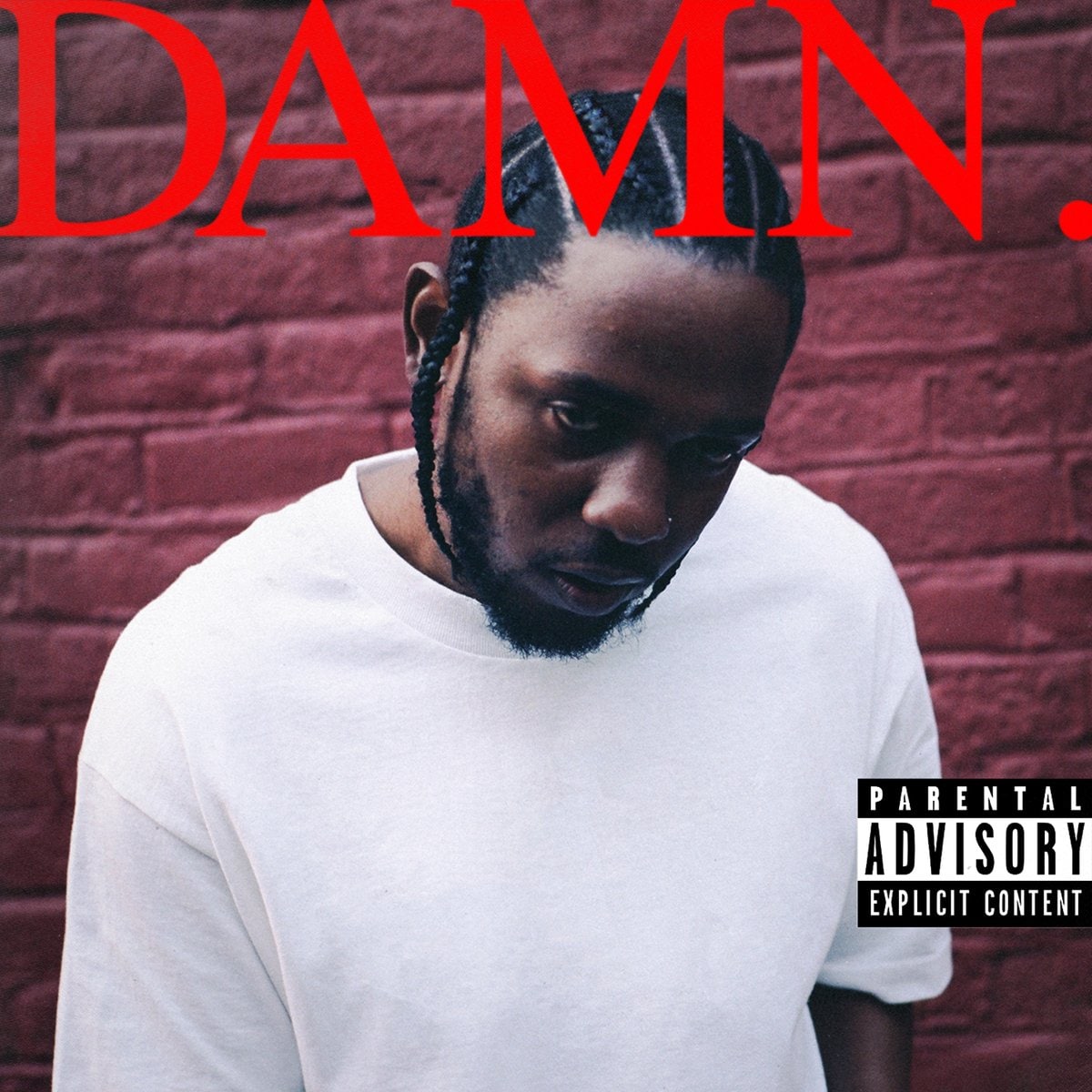
Earlier this week, Kendrick Lamar unveiled the album artwork for highly-anticipated LP DAMN. to a vast mix of opinions. Some loved the simplicity of the cover, while others complained about how uninteresting it was; and even other nitpicked at the enlarged “Parental Advisory” label on the front.
Following the initial responses from everyone, Vlad Sepetov, one of the graphic designers who worked on the album cover took to Twitter to discuss the album’s artwork and reveal small details of its inspiration.
Sepetov, who also had a hand in creating the album cover for Kendrick’s last album, To Pimp A Butterfly, specifically talks about the album’s cover in the series of tweets seen below.
Kendrick’s DAMN., featuring, the likes of U2, Rihanna, Zacari, Teddy Walton, Mike WiLL Made-It, The Alchemist and 9th Wonder, drops tomorrow, April 14th.
already seeing a lot of discussion about the cover. and i’m really excited about it. it’s interesting to see people talk about “bad” design.
— Vlad Sepetov (@VSepetov) April 11, 2017
but i’m incredibly proud of this cover. i sort of bucked a lot of what my teachers taught me. i wanted to make something loud and abrasive.
— Vlad Sepetov (@VSepetov) April 11, 2017
and maybe some won’t see that, but i’m glad that dave and dot saw the value in making something that didn’t fit the mold.
— Vlad Sepetov (@VSepetov) April 11, 2017
just given the bare bones we fleshed something out that has a lot of people talking. it’s not uber political like tpab but it has energy imo
— Vlad Sepetov (@VSepetov) April 11, 2017
@NickyChulo we wanted to make the pa logo part of the design not an afterthought. why make it small? let’s make it huge and embrace it. DAMN.
— Vlad Sepetov (@VSepetov) April 11, 2017
Source: Hip Hop DX
